Histomap of
Consciousness
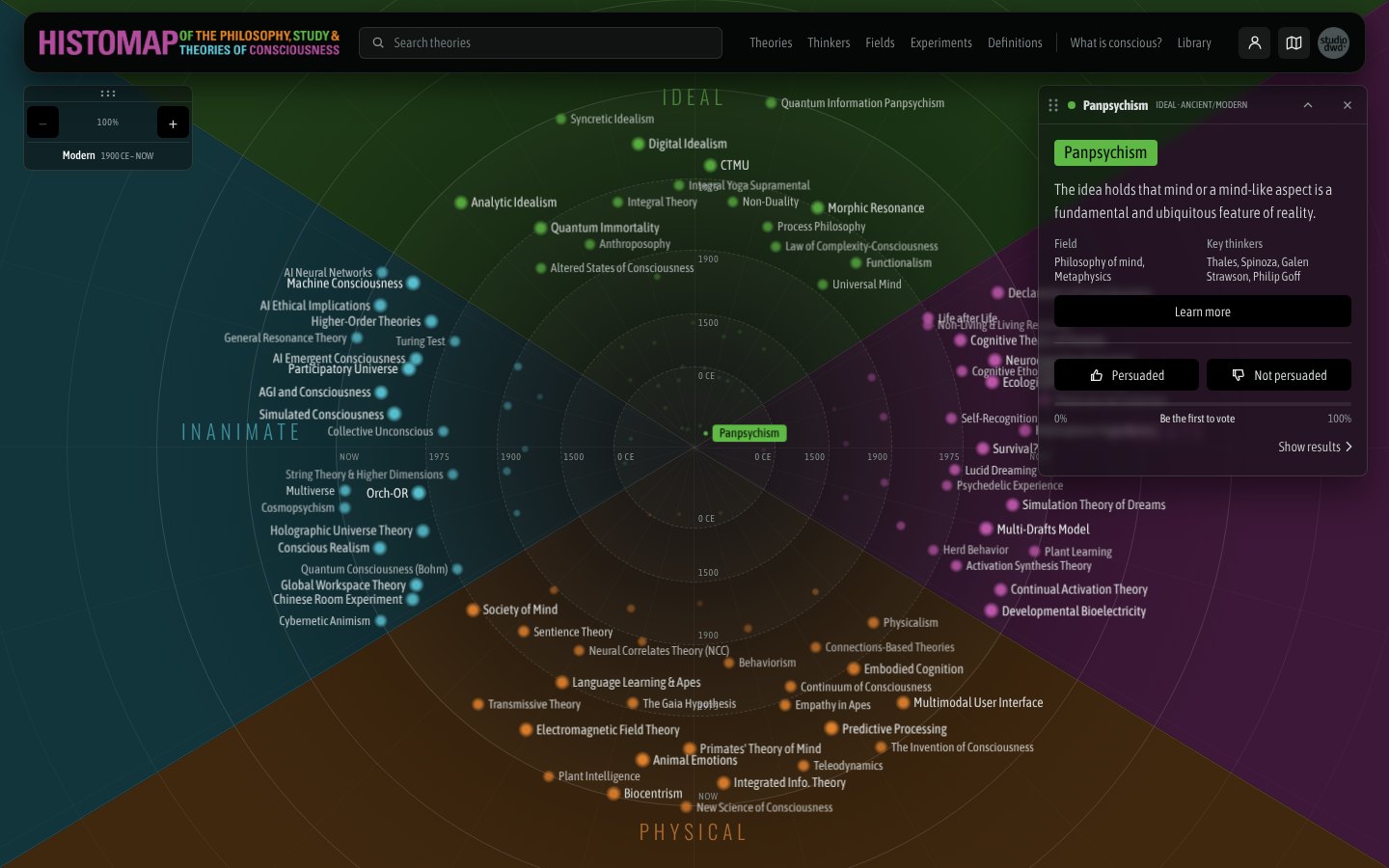
Every major theory of consciousness, from ancient animism to artificial intelligence, mapped by worldview and time. Explore 125 ideas about what it means to be aware.
The Design System
The design system behind the Histomap of Consciousness app (studiodwd.com/consciousness), the first module of The Histomap Project by studiodwd. It is taken directly from the live app's code, so every value here matches what visitors see.
The idea
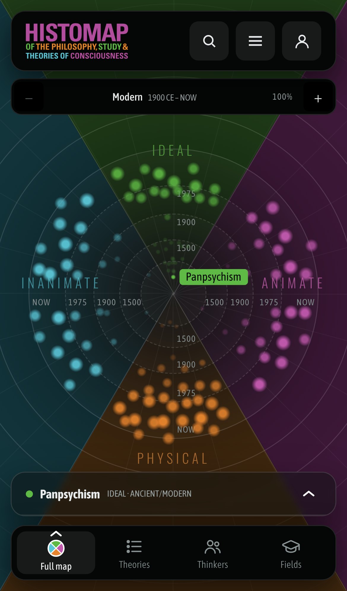
The app is a map of 125 theories of consciousness arranged by worldview and time. Four sections divide the circle: Ideal (top), Inanimate (left), Animate (right) and Physical (bottom). Rings move outward through time, from Ancient at the center through 0 CE, 1500, 1900, 1975 and NOW. Everything else in the system supports reading that map: dark ground, quiet chrome and the four section colors doing the talking.
Content fundamentals
- Voice. Plain, curious and exact, like a good museum label. Short sentences, no hype.
- American English. "Color", "behavior", "labeled".
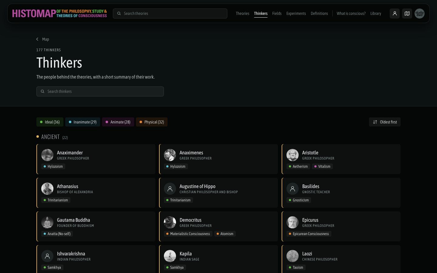
- Names as written by scholars. Theory names keep their own capitalization (Integrated Info. Theory, Orch-OR). Thinkers are sorted by surname.
- Lists are alphabetical within their sections, ignoring a leading The, A or An.
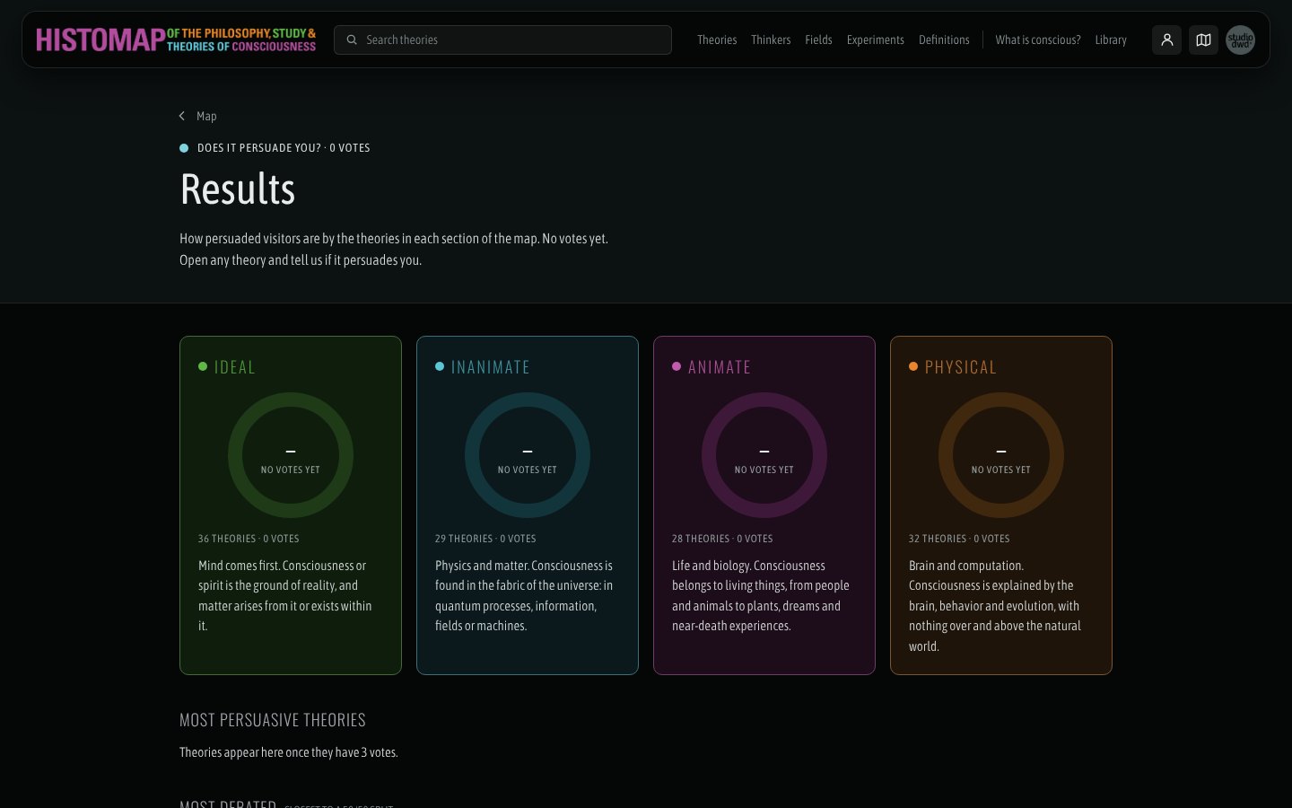
- Counts are honest. "1 vote", "36 theories". With no votes yet, say "Be the first to vote", not 0%.
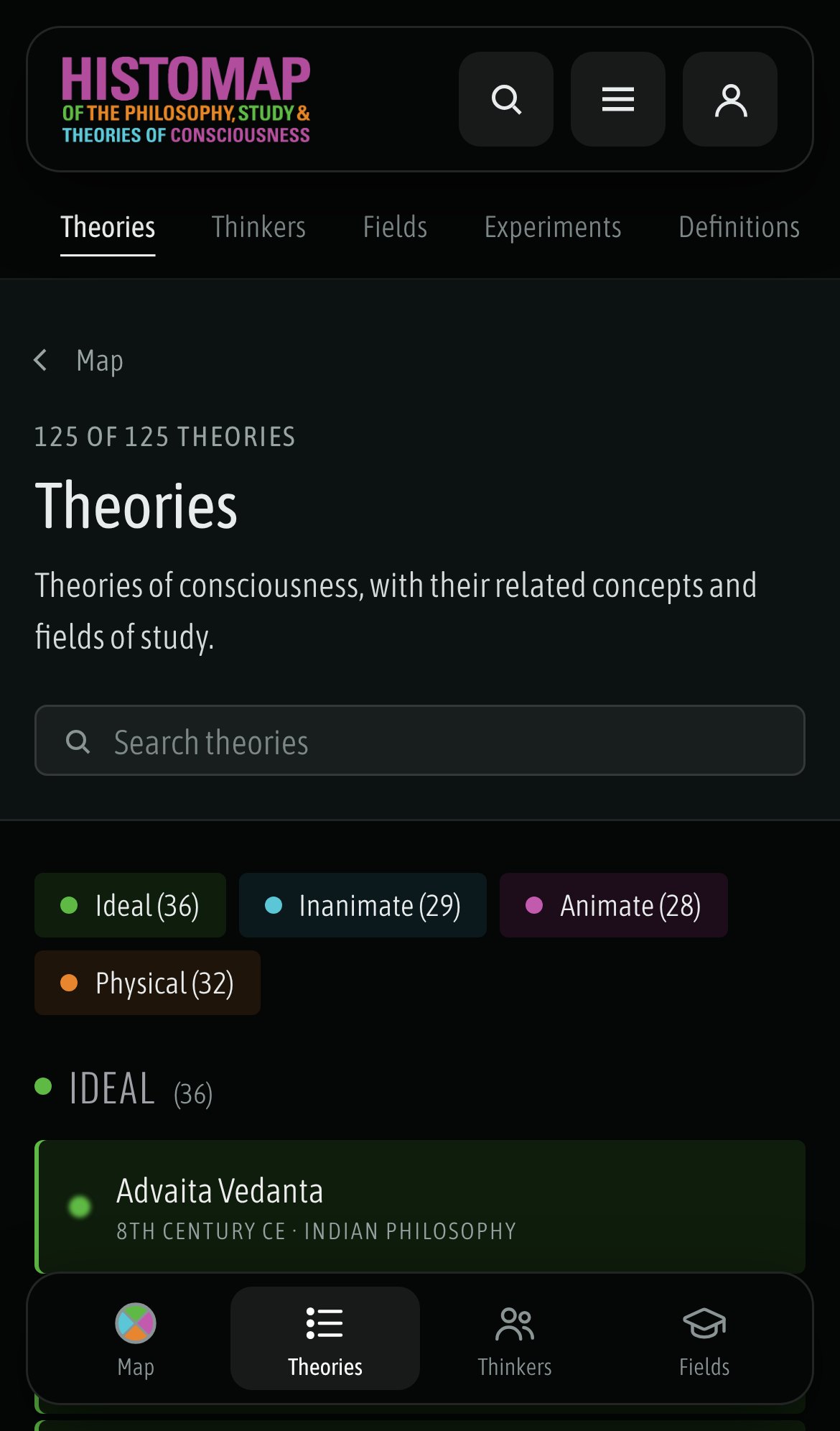
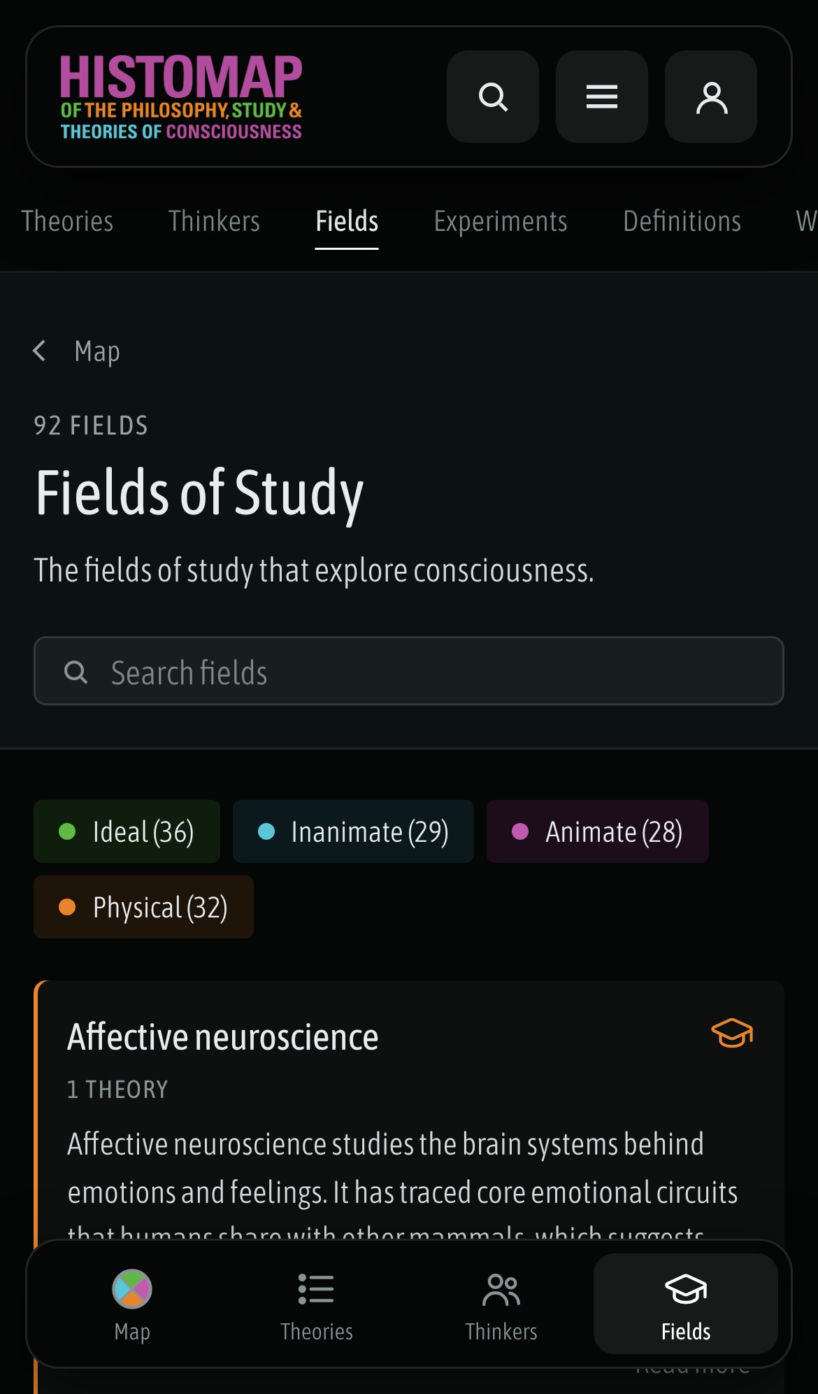
- Labels, not buttons, for categories. Section tags inside cards (Physical 1) are labels. On phone the section chips on list pages are static labels too.
Visual foundations
One dark world. The app has a single dark theme by design. ink is the ground everywhere. Floating bars (header, bottom nav) are ink with a line border, radius-2xl and shadow-bar, so they sit above the map without hiding it.
Section colors carry meaning. Each section has five tokens:
| Role | Ideal | Inanimate | Animate | Physical | Use |
|---|
| color | ideal | inanimate | animate | physical | Dots, nodes, donut arcs, card edges |
| bg | ideal-bg | inanimate-bg | animate-bg | physical-bg | Card and chip fills |
| muted | ideal-muted | inanimate-muted | animate-muted | physical-muted | Map wedges, donut tracks |
| hl | ideal-hl | inanimate-hl | animate-hl | physical-hl | Hover fills, Results borders |
| label | ideal-label | inanimate-label | animate-label | physical-label | Section names on the map |
Never set body text in a section color on ink. Text on a section tint uses fg. A section is always shown with its dot plus its name, never by color alone.
Type. Two Google faces. Oswald (--font-display) at weight 300 for uppercase section names and headings, always letter-spaced. Asap Condensed (--font-body) for everything else, mostly at weight 300, with 400 for titles. The condensed pairing lets long theory names fit on the map.
Shape. Small radii for content (radius-sm tags, radius-md buttons and tiles), large radii only for the floating bars. Dots are circles. Borders over shadows, except for things that float over the map.
Motion. The intro rings expand, nodes drift into place, and donut arcs sweep in with rounded ends. Everything settles within about 1.5 seconds. Keep motion for the map and data, not for chrome.
Links. Gray (muted-2) for in-card links like Read more, right-aligned. Light blue (link) only on the intro screen.
Iconography
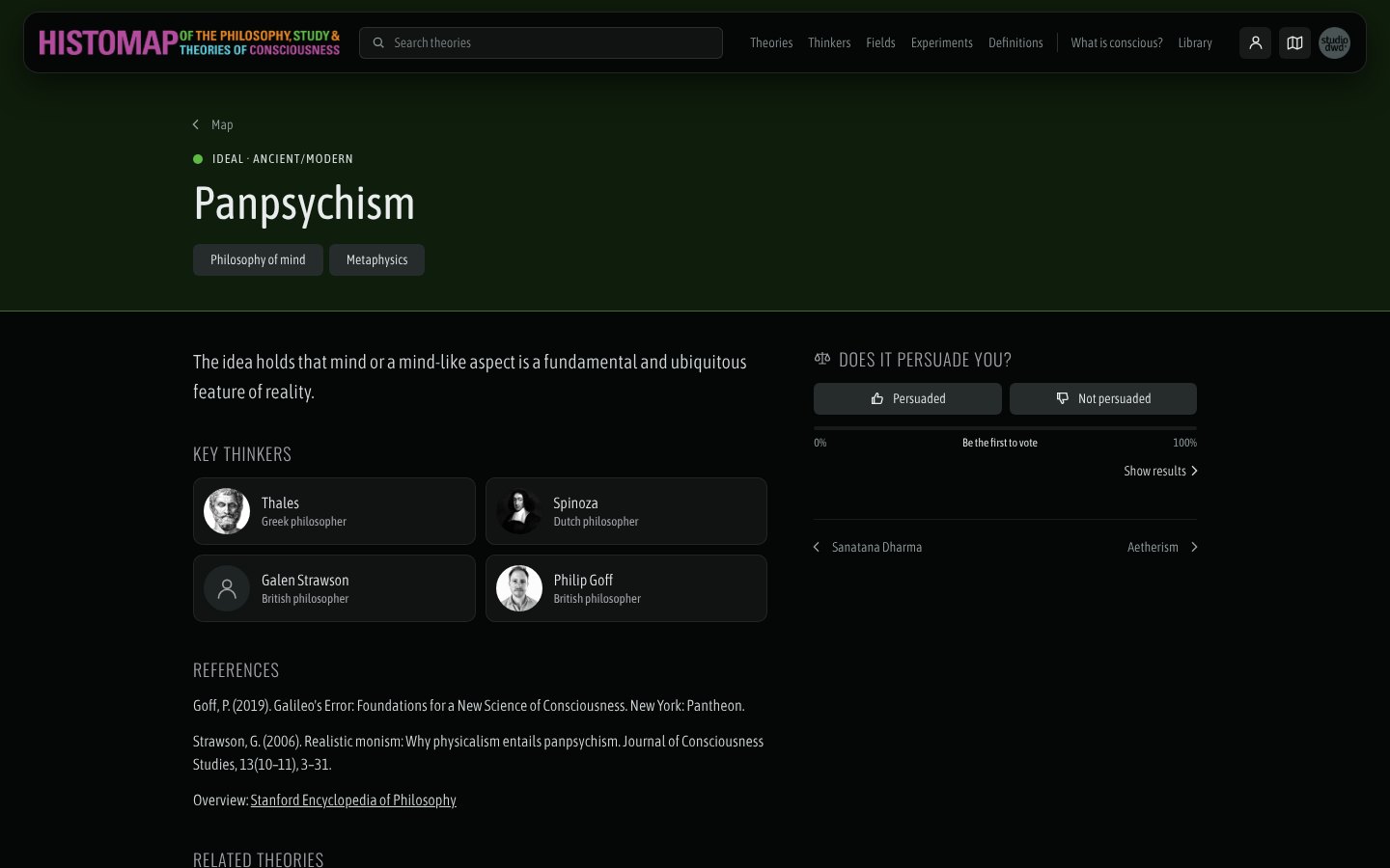
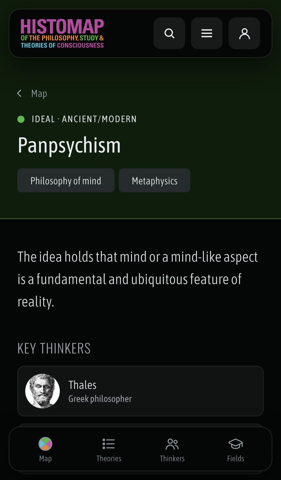
Line icons with round caps and joins, drawn on a 24px grid and sized 16 to 22px: 1.6px stroke for navigation, 2px for small actions. The full set is in the Icons asset group. In the header, the search and About icons become an X while their panel is open. Thinkers without a photo get a person icon in a circle. Section icons are the colored dot plus the name. There are no emoji.
Layout
- Desktop: a floating header 64px tall with 24px side gutters, the map full screen behind it and the theory card at the top right.
- Phone: a stacked logo in the header, a 4-item bottom nav (Map, Theories, Thinkers, Fields) and a theory bar above it. Side gutter is 12 to 16px.
- Page order everywhere: Theories, Thinkers, Fields, Experiments, Definitions, What is conscious?, Library. The menu, top nav, sub nav and next/previous links all follow it.
Logos
See the Logos asset group. Use the horizontal lockup on desktop and the stacked one on phone. Both are full color on a transparent background and are meant for ink.
Colors
One dark theme. Values are hex unless noted.
Ground and text
ink#050707App background, header and bottom-nav fill. The map and every page sit on it.
panelrgba(12,16,16,.5)Floating theory card over the map, used with a 4px backdrop blur.
panel-solidrgba(10,14,14,.9)Opaque panels on phone: search results, About, menu drawer.
field#0A0E0ESearch input and dropdown fill.
linergba(255,255,255,.12)Header, bottom nav and card borders.
line-2rgba(255,255,255,.08)Quiet dividers, donut card borders, empty vote track.
fg#E8ECECPrimary text on ink and on every section tint.
fg-2#D5DBDBBody copy and descriptions.
muted#9AA3A3Secondary labels such as donut captions.
muted-2#8A9494Eyebrows, counts, Read more links and inactive nav labels.
Controls and links
btn#262C2CDefault button fill.
btn-hi#4A5454Button hover and pressed; selected bottom-nav item.
btn-headerrgba(255,255,255,.08)Search, menu and About buttons in the header.
link#8EC9F0Text links on the intro screen.
link-hover#BFE2FAIntro link hover.
persuade#7FD3DFPersuasion bar and Results accents.
Ideal
ideal#5FBA45Ideal section color (Mind comes first.): map nodes, dots, donut arcs and card edges. Never for body text on ink.
ideal-bg#0F1D0CIdeal card and chip fill on list pages.
ideal-muted#1E3A17Ideal wedge on the map and donut track.
ideal-hl#46683AIdeal hover fill and Results card border.
ideal-label#4F8E3DIdeal section name on the map, set in the display face at 15px or larger.
Inanimate
inanimate#5BC6D6Inanimate section color (Physics and matter.): map nodes, dots, donut arcs and card edges. Never for body text on ink.
inanimate-bg#0B191CInanimate card and chip fill on list pages.
inanimate-muted#12343BInanimate wedge on the map and donut track.
inanimate-hl#3E6F78Inanimate hover fill and Results card border.
inanimate-label#3F8E99Inanimate section name on the map, set in the display face at 15px or larger.
Animate
animate#C25AAEAnimate section color (Life and biology.): map nodes, dots, donut arcs and card edges. Never for body text on ink.
animate-bg#1D0C19Animate card and chip fill on list pages.
animate-muted#3D1838Animate wedge on the map and donut track.
animate-hl#6F3E66Animate hover fill and Results card border.
animate-label#A2508FAnimate section name on the map, set in the display face at 15px or larger.
Physical
physical#E8862FPhysical section color (Brain and computation.): map nodes, dots, donut arcs and card edges. Never for body text on ink.
physical-bg#1F140APhysical card and chip fill on list pages.
physical-muted#40280FPhysical wedge on the map and donut track.
physical-hl#7A5634Physical hover fill and Results card border.
physical-label#A86A30Physical section name on the map, set in the display face at 15px or larger.
Charts
iris#9B7EDFWhat is conscious? timeline accent and the Cambridge Declaration.
gold#E2BE4FSecondary chart series on the timeline.
coral#E0676BSecondary chart series on the timeline.
pink#E383AESecondary chart series on the timeline.
neutral#C9CFCFNeutral chart series and unassigned items.